A brand style guide is one of the most underrated tools a founder can have. Not because it looks professional, but because it removes hundreds of small decisions from your plate every time you create something. No more second-guessing which shade of green to use, or whether this font is the right one. Your guide makes the decision for you.
In this post I'm sharing the same principles I use when building brand guidelines for founders so you can maintain your brand consistently and confidently on your own.

Your brand identity, brand voice & brand guidelines
You might be here asking "are brand guidelines important?" And the ultra short answer is... aaabsolutely.
Great brand guidelines are like a cherry on top of a sundae - it's what takes your brand identity to the next level. It's not just about having a fancy logo - a strong brand identity with the right brand elements and a cohesive style guide are key to success.
Your brand identity guidelines (or, some call it a brand book) act like a user manual, guiding you on how to keep everything from your brand story, to your brand image and your brand voice consistent and on-brand. By keeping everyone who touches your brand on same page, you unleash your brand's personality and make it unforgettable. So, take the time to create a simple, purposeful and holistic brand style guide and watch your brand stand out.
How to build a brand style guide
A brand style guide is like a superhero's cape - it gives you the power to soar above the competition with consistent messaging and a cohesive brand identity. Think of it as your branding utility belt, equipping you with the tools to maintain a superhuman level of consistency across all platforms.
From the colors of your logo to the tone of your messaging, brand style guides ensure brand consistency and is your trusty sidekick. Watch the video above or navigate to this article to learn how to build yours.

Grab Verô's Own Your New Brand Guide
Alright, now with your brand guidelines in hand, let's dive in on how to use it. While the Own Your New Brand Guide is typically reserved for my private branding and website clients, I'm thrilled to be sharing it with you today! This guide is the ultimate tool for maintaining your brand with best design practices. It's not just about creating a great brand, but also about empowering yourself to maintain it in the long run. As a fellow small business owner, I totally get the importance of self-sufficiency. That's why this guide is all about giving you the tools you need to be your own branding guru.
Where to (even) begin: Set up your Canva Brand Kit
Are you tired of constantly recreating your branding assets every time you need to make a new design? Say no more! The first step in the Own Your New Brand guide is all about setting up your Canva Brand Kit. It's like a one-stop-shop for all your branding assets, making it so much easier to create new designs with a cohesive look and your brand's voice and feel. Set it and forget it, and you'll have more time to focus on the fun stuff like brainstorming new marketing ideas or daydreaming about your next vacation.
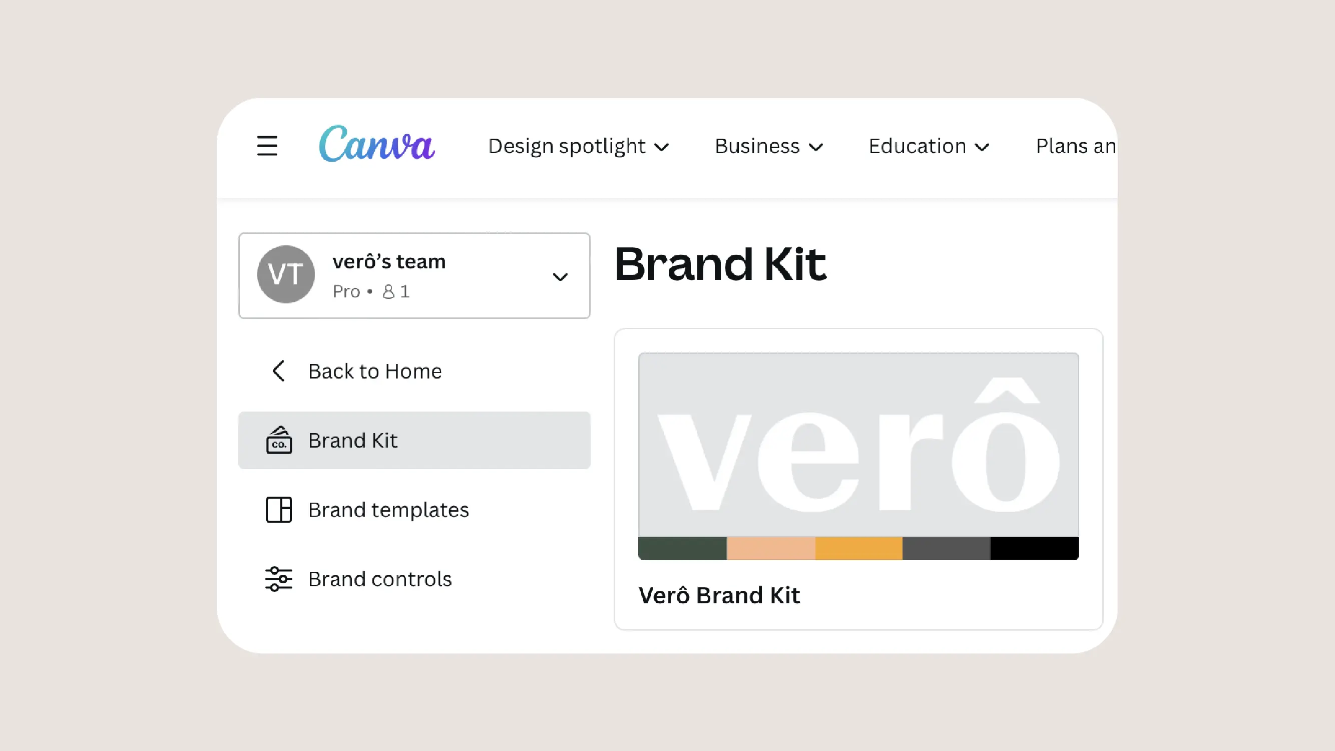
To get started, log in to your Canva account and click on the left sidebar to access the Brand Kit section. Here, you can upload your primary and secondary logo files in .SVG format, along with all the colors in your brand palette. You can even upload your brand fonts, including your title and body copy fonts, to use in your designs. The Canva Brand Kit is a powerful tool for anyone looking to create consistent and professional designs, so be sure to set it up before getting started on your next project.
How to use your brand colors effectively
Your brand colors are like your brand's signature touch, and using them correctly is crucial for creating a consistent and recognizable image. It's not just about slapping your colors on everything, but also about using them strategically to reinforce your brand's message and identity. Make sure to establish guidelines for your brand colors, including their proper use and combinations. Consistency is key, so be sure to use the same colors across all of your marketing materials, from your website to your social media posts to your product packaging. Remember, your brand colors have the power to influence how your audience perceives your brand, so use them wisely and strategically to create a strong and memorable brand identity.

To effectively use your brand colors, start by referring to your brand guide, which should include all of your colors together with their respective hex codes. It's important to understand which colors are primary, secondary, and tertiary, as this will guide you in selecting colors for various design elements. Your primary color(s) should be used the most to help your audience connect your brand with your color. You can use primary colors as a background or accent color, or however you like, but make sure to use them often. Secondary colors provide more flexibility and are best used for backgrounds and accents. Tertiary colors offer more options within your palette and can be used for small details, links, or illustrations. You can play with different opacities of your colors to give you more flexibility while staying within the same ratio as your brand color palette. Finally, when creating designs, try to use your primary color prominently while breaking it up with your secondary and tertiary colors to add a little surprise and interest. When using brand photography, add your colors sparingly as a nod to your color palette.
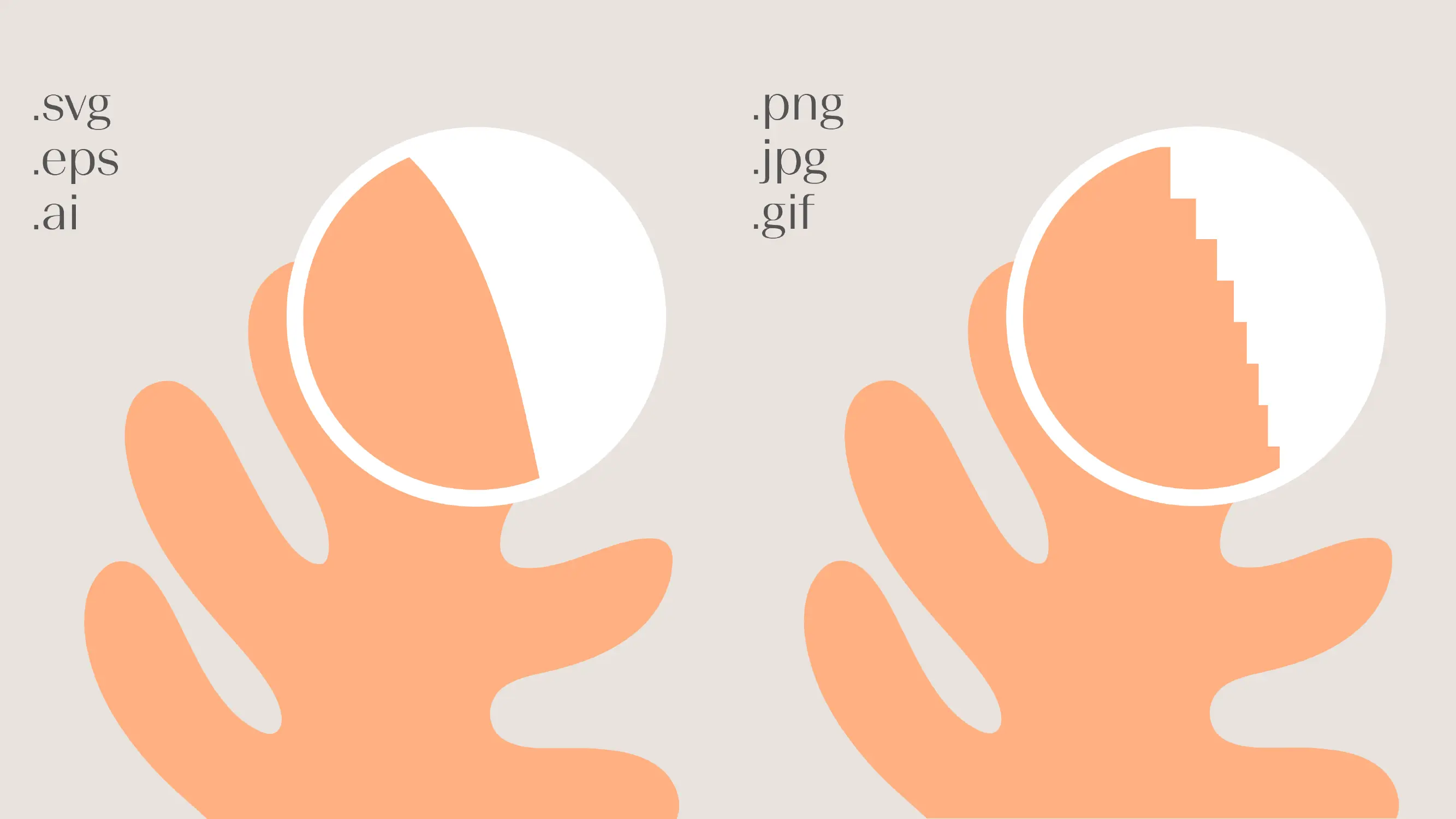
Don't be a logo-no-go: How to use your logo like a pro
Let's face it, your company logo is part of the face of your brand. It's one of the first things people see and remember. That's why it's important to use it correctly and consistently. Don't be a logo-no-go! Make sure you have the right file types for different applications and sizes, and use it in the right colors and backgrounds. And don't even think about stretching, squishing, or distorting it. The same goes for your secondary logos! Your logo is the superhero of your brand and it deserves to be treated like one.

Using your brand logo effectively is an important aspect of building brand recognition. The primary logo should be used as often as possible to build familiarity with your audience, while the secondary logo provides flexibility in instances where the primary logo may not be legible at a certain scale. It's important to maintain a strong contrast between the logo and the background, and to provide plenty of space around the logo to avoid clutter. Avoid rotating, stretching, cropping, skewing, or altering the logo in any way (please!), and don't apply effects such as drop shadows. Stick to the colors in your brand's color palette, and don't obstruct or add to the logo. Negative space is also important for creating a professional and uncluttered look. Verô's hot tip: By adding a square of the same size as the logo's height and finding the middle of the square, you can create a padding around the logo that will allow for sufficient breathing room.
Font finesse: How to use your brand fonts
Your brand fonts are like the stylish shoes that complete your outfit - they need to be the right fit and style to make a good impression. Using your brand fonts correctly is essential for creating a consistent and professional image that resonates with your audience. Don't just pick a font because it looks pretty, but choose one that aligns with your brand personality and values. Once you've selected your font(s), establish guidelines for their use, including size, spacing, and hierarchy. Consistency is key, so make sure to use the same font(s) across all of your marketing materials, from your website to your product packaging. And don't forget to ensure that your fonts are legible on all platforms, from desktop to mobile.